PROJECT:
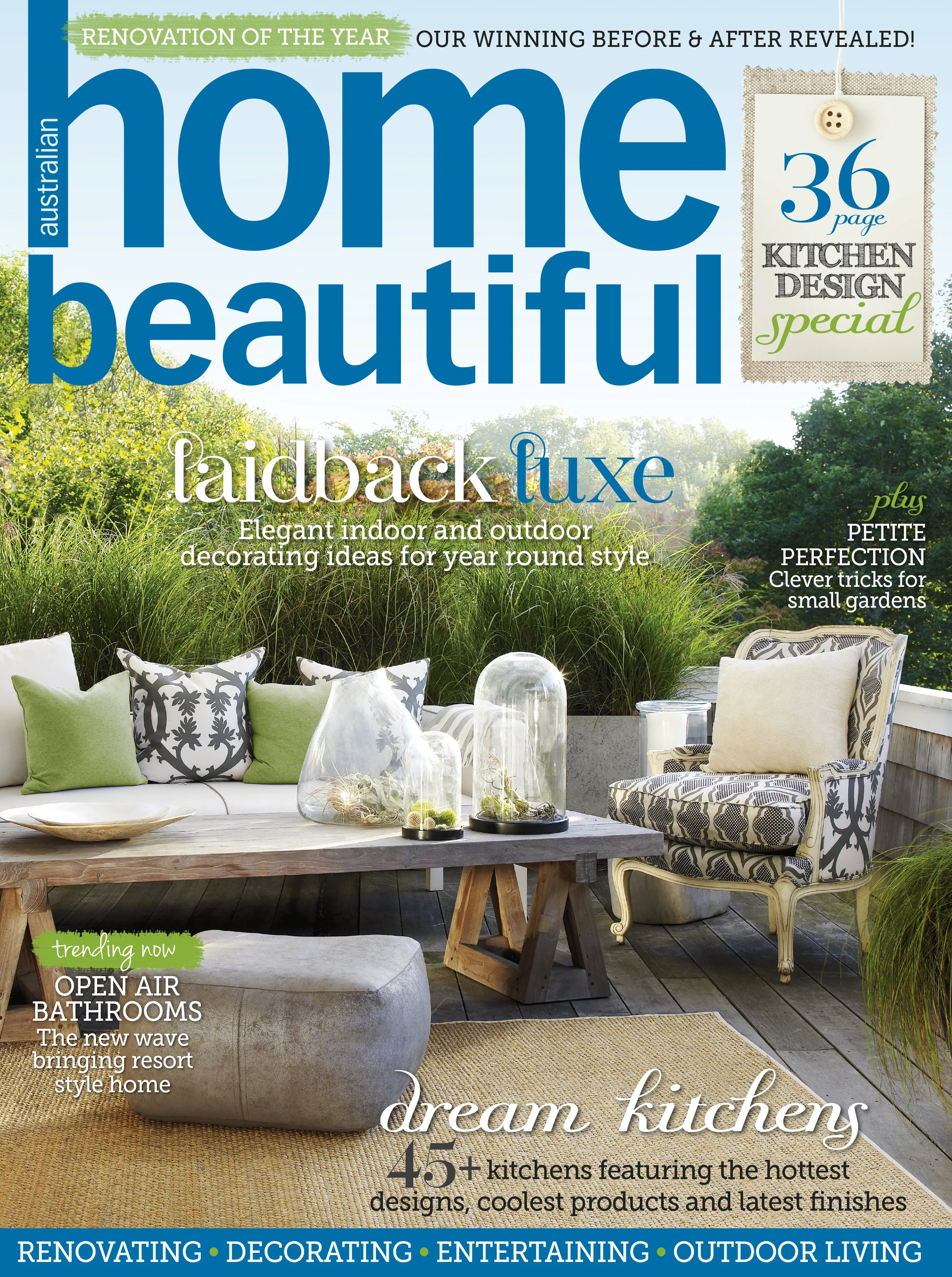
HOME BEAUTIFUL
ROLE:
DESIGN LEAD
PROJECT OBJECTIVES:
Home Beautiful was somewhat of a modern day anomaly - they did not have an online presence. Their desire was to have a website that would showcase their premium content, and provide their readers with an additional avenue to consume and interact with their brand.
The objectives of the project were:
Release multi-device site for mobile and desktop
Curate a strong brand presence
Create a pleasurable user experience
Extend the platform from which to share content with users
Ensure ongoing innovation and scalability
Meet all key business, sales and partner requirements
PROBLEM STATEMENTS:
There is no existing website
A lot of additional content is not being utilised
There is no way to connect with readers beyond the pages of the magazine
Key stakeholders & partners are feeling grossly under-serviced
DESIGN RATIONALE:
After speaking with the publisher and product owners, it quickly became apparent that all they wanted was a beautiful site - but that part was easy.
What I saw was the clean slate that temptingly lay before me.
Give a designer a square and they'll make you a sphere.
My design rationale was:
Create a UI that capitalised on the rich content and gave the design aesthetic a modern feel
Redefine the existing parameters for the user experience
Clean up the UI and implement a simpler interface
Minimise technical and producer workflow by streamlining the overall UI and UX
Showcase the Home Beautiful brand whilst remaining true to the Yahoo7 styling
Ensure all business, sales and partner requirements are met
PROJECT HIGHLIGHTS
Obliterate the mould
Without the constraints of an existing ideal, the Home Beautiful project afforded me the opportunity to experiment with the UI and UX. I was able to explore unchartered territory for Yahoo7 and think beyond 'just the usual'.
Noticing a shift in the way users were consuming content, I took the approach of introducing a card masonry stream.
UI was simplified and content was allowed more breathing space, making the content easier to consume.
UX was intuitive. By adopting the sensibilities often seen in social media, the navigation and consumption of content became instinctive for the user.
Utilising rich imagery created a compelling environment for the user to explore. Due the nature of the content, this was an easy win.
Distinctive typography allowed for easy scanning of content. Choice of fonts emulated those used in the magazine.
Using the 'Z'; by randomly alternating between landscape and portrait imagery, I was able to create a natural eye line path that encouraged the user to scan the page from left to right and down. The scattered structure created interest and compelled the user to scroll and engage with the content.
UI was scalable across devices, automatically adjusting to a single column on mobile whilst retaining the specifications of desktop with the image and font sizes.
With a 'free-for-all' attitude to the design, I was able to unleash all the ideas I had bubbling within. I wanted to add to the user experience, giving them a new yet familiar way to read the content they loved.
PROJECT OUTCOMES + ACHIEVEMENTS:
Due to the marked success of this new UI for the Yahoo7 network, it was rapidly adopted as the standard layout for successive site builds. Since the launch of Home Beautiful, the card masonry stream has been rolled out to 14 Yahoo7 properties.
I am exceptionally proud of the work I achieved with this project. I was able to flex my creative UX muscle and deliver a site that not only looked beautiful but it functioned beautifully as well.
With the simplification of the UI, the overall build production time was reduced from 2 months to 1 month.
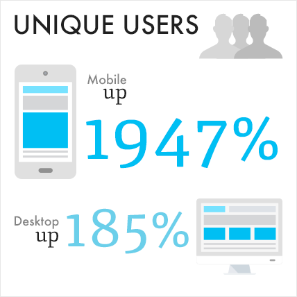
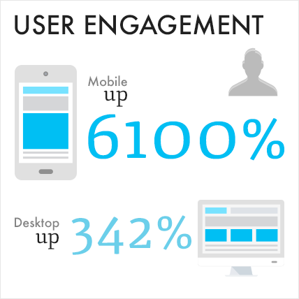
Further to this, the success metrics for the site reached heights that were previously inconceivable.
"I’m looking at it now on desktop and mobile – it looks great! Thank you"
- Karen Deveson
Publisher - Homes and Health, Pacific Magazines
"It definitely has a nice fresh feel and the larger images look great. I know it’s been a huge undertaking so well done Yahoo team."
- Zoe Sabados
Group Marketing Director, Pacific Magazines
Source: Yahoo! Data Mining (AU IPS) Digits March 2014 vs. March 2015


