PROJECT:
JOE BANANAS ICON DESIGN
ROLE:
CREATIVE DIRECTOR | DESIGNER
PROJECT OBJECTIVES:
Create an icon that would be easily recognisable and synonymous with the brand.
The objectives of the project were:
Design aesthetic to ensure a strong brand presence and reflect the brand's philosophy and voice
Icon must be suitable for use across print and digital, with adaptability and scalability
DESIGN RATIONALE:
I knew the icon had to reflect the individuality of the brand yet still be relatable so as not to alienate the more traditional clientele. It had to be the perfect mix of classic and left-of-centre. It was also important for the icon to play on the handcrafted element of the clothing and not be too clinical in approach.
THE PROCESS
Peeling the banana
Of course, when one thinks of art + banana, the mind immediately steers towards that of Andy Warhol. With this in mind, it was incredibly important that I approached the design from a unique angle.
Equally, the banana is often a comical reference: slipping on a banana peel, monkey business etc. Again, this was not something I was interested in associating with the brand.
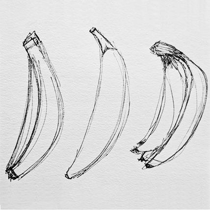
So I bought myself a hand of bananas and began to sketch it out.
Andy Warhol's banana print used on the album cover of The Velvet Underground's iconic debut record, The Velvet Underground & Nico.
STEP ONE: Exploratory design using hand sketches
STEP 2: Set up basic outline of banana in Illustrator
STEP 3: Finalise design with colour
THE RESULT
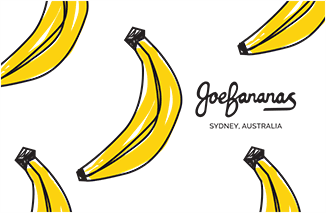
How do you like them bananas?
It was important that the banana was not perfect and played to the brand's tongue-in-cheek voice. Keeping the sketch lines loose and having the colour creep outside the lines was intentional in the design to reflect the unique handcrafted textiles of the brand and the overarching ethos of the brand which was 'individual'.


