PROJECT:
JOE BANANAS Rebrand
ROLE:
CREATIVE DIRECTOR | Designer
PROJECT OBJECTIVES:
The Joe Bananas brand had grown organically since its inception in the 80s - and so too had its branding. In other words, it was a hodgepodge of decisions made across the decades - and not many of them made sense in today's market.
The objectives of the project were:
Create a cohesive brand style guide.
Bring the brand into the current day and elevate it to a level that would position it alongside other major international luxury brands.
RATIONALE:
As Creative Director, I felt it was crucial to provide the customer with a comprehensive customer experience across every touchpoint - analog and digital. Beyond this, I felt it was also necessary that the experience around the sale must also deliver the same level of luxury of the product itself. Basically, the brand needed to up its game and I was going to make it happen from the ground up.
THE BASICS
Colour Palette
Classic, timeless, adaptable
Matte black
Classic white
Banana yellow
Antique gold
Fonts
Modern and classic
Primary font
Secondary font
Logo + Icon
Logo treatments for print and digital usage
BRANDING IN PRACTICE
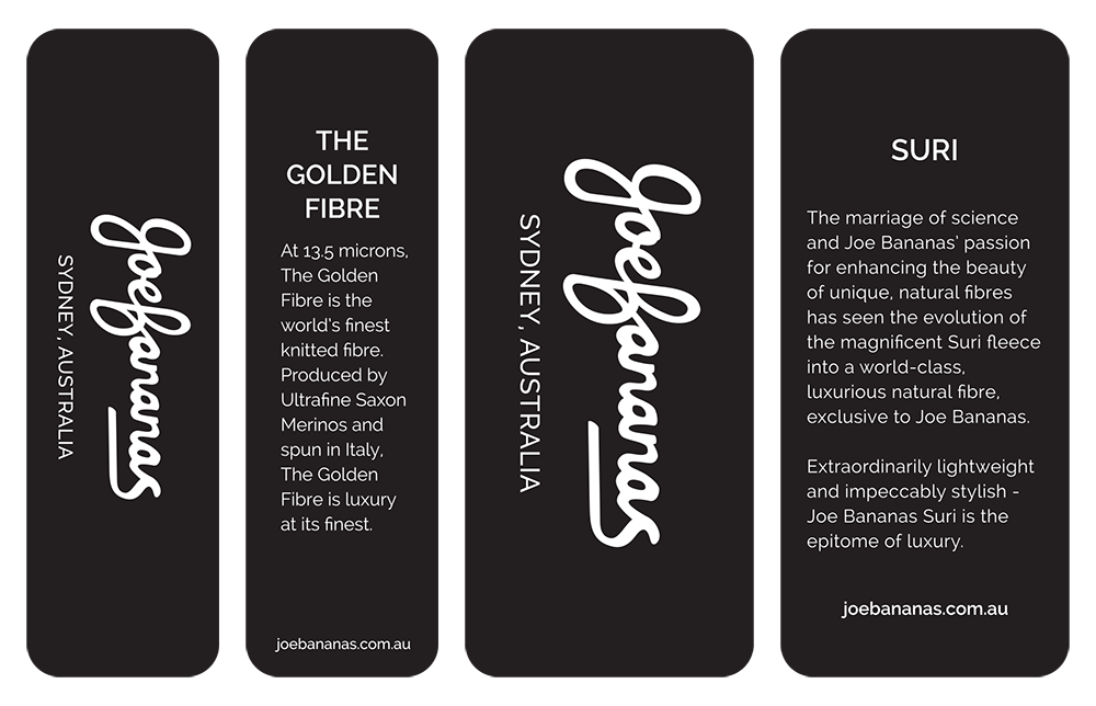
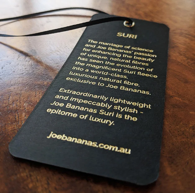
Swing tags
Business cards
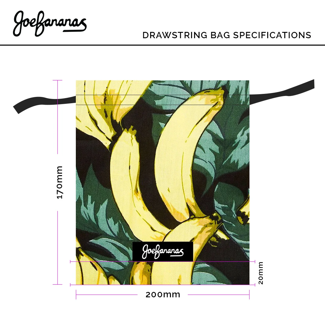
Tie + Bow tie bags


