

Digital Design
Digital Design

marie claire Australia
marie claire Australia
PROJECT:
MARIE CLAIRE AUSTRALIA RELAUNCH
ROLE:
DESIGN LEAD
PROJECT OBJECTIVES:
As a flagship masthead for Pacific Magazines, marie claire Australia was the first of the Pacific Magazine brands to be redesigned and relaunched with a mobile site.
The objectives of the project were:
Release a site for mobile and desktop
Retain the base design aesthetic to ensure a strong brand presence
Improve user experience
Ensure ongoing innovation and scalability
Meet all key business, sales and partner requirements
PROBLEM STATEMENTS:
There is no existing mobile site
Content structure is too limiting
Site performance is slow
Key stakeholders & partners are feeling under-serviced with the current site
The marie claire desktop website prior to redesign not only suffered from a dated aesthetic but many of its UI elements made for a cumbersome user-experience.
As a result, much of the rich content was not being seen by users as it was not easily discoverable.
DESIGN RATIONALE:
Due to my previous experience with Pacific Magazines, I was already confident in my visual design approach, thus my primary focus was to improve the UX and UI of the site.
My design rationale was:
Create a flexible and scalable site was adaptable across devices
Provide UI solutions to ensure content was easily discoverable
Improve UX through thoughtful and measured design decisions
Respectfully showcase marie claire brand whilst remaining true to the Yahoo7 styling
Ensure all business, sales and partner requirements are met
"The new site has delivered everything and more. It IS The perfect fit for A prestigious brand."
- Alex Main, Senior Product Manager - Travel, Lifestyle and Entertainment, Yahoo7
PROJECT HIGHLIGHTS
One size fits all
One of the greater UI challenges for this project was the varying image orientations and specifications. Due to the predominantly fashion and beauty-centric content of marie claire, much of the image collateral was of portrait orientation, whereas the Yahoo7 network had traditionally catered for landscape orientation only. In order to combat this, I created a UI that accommodated a broader range of scenarios that could easily adapt to both orientations, across all devices.
The result was not only a more flexible format for producers to utilise, but it also saw a positive influence on user engagement.
By adapting the UI to fit the specific content available, a greater diversity of content could be surfaced. Through this modification, it quickly became evident that the use of rich visual collateral was a key performance driver for user engagement, and ultimately resulted in a significant increase in the consumption of this content type.
Finding the treasure
Another key challenge facing this project was the issue of undiscoverable content.
How do we make it easy for users to discover more content?
Simple - by making it easier for them to find.
By creating a content rail, a greater number of content assets could be surfaced - that ticked the first box.
The vertical layout made it easy for users to quickly scan the content. The images provided the visual driver, and the headline supported it.
The initial design saw this module with tabbed content: 'most viewed' and 'latest'. However, later iterations would see the removal of the secondary tab as it appeared users were not interacting with it. Instead, the number of items listed increased - as did user engagement.
But what else could be done to drive user engagement?
By placing the module in a consistent position on the right-hand side of each page, there was minimal need for user training thus keeping the user engaged.
Furthermore, by curating the content based on performance, producers could serve content that was fresh and interesting for the user.
The use of iconography was another method to compel users to interact with the content. Photo galleries and videos always perform well, thus it is beneficial to highlight these assets where appropriate.
The introduction of the right-hand content rail immediately addressed the issue of unsurfaced content. By placing it in an easily discoverable position on the site, there was a dramatic increase in content consumption and still proves to be one of the key traffic drivers for site reticulation.
PROJECT OUTCOMES + ACHIEVEMENTS:
By streamlining the overall UI, production time for the marie claire Australia site build was reduced from 12 months (as per the previous project's timeline) to 2 months, saving the business a considerable amount in resource time and revenue.
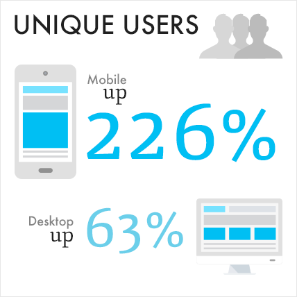
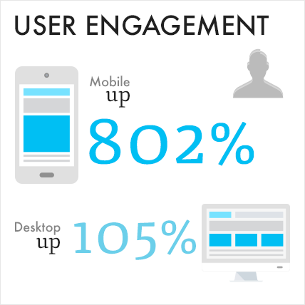
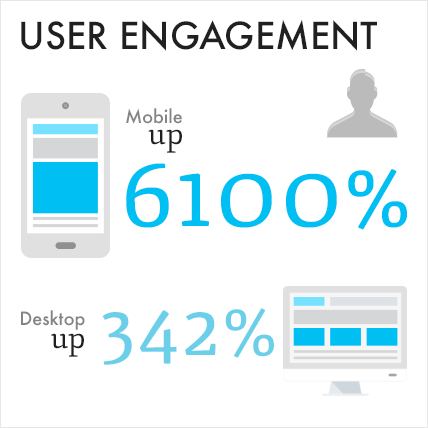
From the initial testing up until present day, the site redesign for marie claire Australia has proven to be a great success. There has been a significant uplift in user engagement both on desktop and, of course, mobile. The fact that this uplift has sustained itself for more than 12 months in market is testament to the UX of the site design
"I would really like to thank Hiona, from Yahoo design, who pulled the look and feel of the site together on brand and on deadline"
- Jackie Frank
Publisher/ Editor - marie claire Australia, Pacific Magazines
Source: Yahoo! Data Mining -Digits (AU IPS) 2013/14/15, uplift based on: monthly average (UU or PVs) of 6 months prior launch vs. monthly average of 6 months post launch

Home Beautiful
Home Beautiful
PROJECT:
HOME BEAUTIFUL
ROLE:
DESIGN LEAD
PROJECT OBJECTIVES:
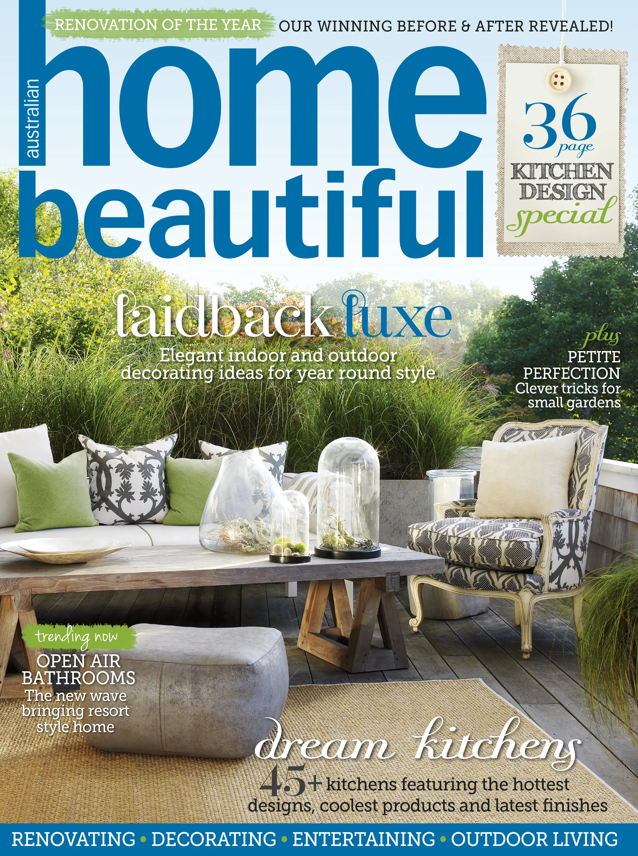
Home Beautiful was somewhat of a modern day anomaly - they did not have an online presence. Their desire was to have a website that would showcase their premium content, and provide their readers with an additional avenue to consume and interact with their brand.
The objectives of the project were:
Release multi-device site for mobile and desktop
Curate a strong brand presence
Create a pleasurable user experience
Extend the platform from which to share content with users
Ensure ongoing innovation and scalability
Meet all key business, sales and partner requirements
PROBLEM STATEMENTS:
There is no existing website
A lot of additional content is not being utilised
There is no way to connect with readers beyond the pages of the magazine
Key stakeholders & partners are feeling grossly under-serviced
DESIGN RATIONALE:
After speaking with the publisher and product owners, it quickly became apparent that all they wanted was a beautiful site - but that part was easy.
What I saw was the clean slate that temptingly lay before me.
Give a designer a square and they'll make you a sphere.
My design rationale was:
Create a UI that capitalised on the rich content and gave the design aesthetic a modern feel
Redefine the existing parameters for the user experience
Clean up the UI and implement a simpler interface
Minimise technical and producer workflow by streamlining the overall UI and UX
Showcase the Home Beautiful brand whilst remaining true to the Yahoo7 styling
Ensure all business, sales and partner requirements are met
PROJECT HIGHLIGHTS
Obliterate the mould
Without the constraints of an existing ideal, the Home Beautiful project afforded me the opportunity to experiment with the UI and UX. I was able to explore unchartered territory for Yahoo7 and think beyond 'just the usual'.
Noticing a shift in the way users were consuming content, I took the approach of introducing a card masonry stream.
UI was simplified and content was allowed more breathing space, making the content easier to consume.
UX was intuitive. By adopting the sensibilities often seen in social media, the navigation and consumption of content became instinctive for the user.
Utilising rich imagery created a compelling environment for the user to explore. Due the nature of the content, this was an easy win.
Distinctive typography allowed for easy scanning of content. Choice of fonts emulated those used in the magazine.
Using the 'Z'; by randomly alternating between landscape and portrait imagery, I was able to create a natural eye line path that encouraged the user to scan the page from left to right and down. The scattered structure created interest and compelled the user to scroll and engage with the content.
UI was scalable across devices, automatically adjusting to a single column on mobile whilst retaining the specifications of desktop with the image and font sizes.
With a 'free-for-all' attitude to the design, I was able to unleash all the ideas I had bubbling within. I wanted to add to the user experience, giving them a new yet familiar way to read the content they loved.
PROJECT OUTCOMES + ACHIEVEMENTS:
Due to the marked success of this new UI for the Yahoo7 network, it was rapidly adopted as the standard layout for successive site builds. Since the launch of Home Beautiful, the card masonry stream has been rolled out to 14 Yahoo7 properties.
I am exceptionally proud of the work I achieved with this project. I was able to flex my creative UX muscle and deliver a site that not only looked beautiful but it functioned beautifully as well.
With the simplification of the UI, the overall build production time was reduced from 2 months to 1 month.
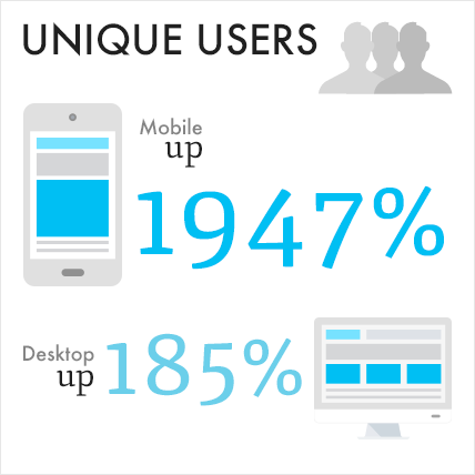
Further to this, the success metrics for the site reached heights that were previously inconceivable.
"I’m looking at it now on desktop and mobile – it looks great! Thank you"
- Karen Deveson
Publisher - Homes and Health, Pacific Magazines
"It definitely has a nice fresh feel and the larger images look great. I know it’s been a huge undertaking so well done Yahoo team."
- Zoe Sabados
Group Marketing Director, Pacific Magazines
Source: Yahoo! Data Mining (AU IPS) Digits March 2014 vs. March 2015

Yahoo7 TV Guide
Yahoo7 TV Guide
PROJECT:
YAHOO7 TV GUIDE
ROLE:
DESIGN LEAD
PROJECT OBJECTIVES:
This one is an oldie but a goodie. It was my first, full-fledged foray into UX Design all the way back in 2010 - and it was a treat.
There was really only one objective for this project: be the best in market. This was before mobile was a consideration and desktop was king.
The objectives of the project were:
Release a market-leading TV Guide
Aggregate content from Free-to-air and cable television suppliers Australia-wide
Create a personalised experience for users
Meet all key business, sales and partner requirements
PROBLEM STATEMENTS:
Current offering is clunky and difficult to navigate
Users aren't able to customise and/ or save their preferences
All suppliers must be given equal coverage
Need to devise revenue streams
DESIGN RATIONALE:
From the outset, the goal was clear: be different. The market was fiercely competitive, but a TV guide was still just a TV guide - that was until we came along.
My design rationale was:
Reimagine the UI to contain offerings that do not currently exist in market
Deliver the user what they need but also what they want
Create a personalised experience for users to customise
Simplify the navigation - make it intuitive and easy to master
Create revenue opportunities that have minimal impact on the user experience
PROJECT HIGHLIGHTS
I want what I want
With such a broad offering of results, it was imperative that users were able to find the content they wanted precisely when they wanted it. This was achieved in a number of ways:
Filter by genre
Users could filter by genre via a simple check box within the main TV Guide navigational panel.
By using a highlight colour for each genre, users can easily distinguish the shows they are interested as they scan the guide - no matter the channel or timeslot.
Loading of content is dynamic, providing an instant and expected result for the users' action.
Customised TV Guide
Nowadays, the concept of the 'Like' button is ubiquitous in the online realm, but in 2010 it was still finding its way into the everyday. Of course now we see the Like button as a simple and quick way to share content. However, in this instance, it is used to create a personalised experience.
By clicking on any show title, a user is presented with a breakout box containing more show information and the option to Like the show.
By liking a show, the user is creating a saved list of preferences that they are able to navigate to at any time via the main TV Guide navigational panel.
If a user opts to display only shows they like, they are presented with a tailored TV Guide specific to their preferences.
Filter by Provider/ Location/ Date/ Time
This is, of course, a given - but it has to be done well otherwise what's the use of it? Here users can dynamically filter results by each parameter independently. It's a tidy solution to organising a plethora of data.
That little bit extra
Whilst it isn't a necessary detail, the addition of a timeline indicator is a detail that adds to the user experience. Users could also navigate forward and back in time. It was a key point of difference to our competitors at the time.
PROJECT OUTCOMES + ACHIEVEMENTS:
Having launched in 2010, the Yahoo7 TV Guide continues to be one of Australia's market-leading online TV Guides - a true testament to the UX design process and execution of the project.
Source: “Mobile Experience Usability Testing Report”. The research undertaken was consistent with the Common Industry Specification for Usability (CISU-7432).
SURVEY USERS RATED THE YAHOO7 TV GUIDE AS:
9/10 usable
9/10 useful
9/10 credible
9/10 desirable
9/10 findable
9.5/10 valuable
"OUR TRAFFIC FIGURES HAVE INCREASED SIGNIFICANTLY & THE FEEDBACK FROM USERS HAS BEEN MORE THAN POSITIVE. IT'S A CREDIT TO HIONA'S DESIGN AND HARD WORK ON THIS PRODUCT."
- Homaira Razi
Broadcast Integration Manager - Yahoo7


