
Branding
Branding
Icon Design
Icon Design
PROJECT:
JOE BANANAS ICON DESIGN
ROLE:
CREATIVE DIRECTOR | DESIGNER
PROJECT OBJECTIVES:
Create an icon that would be easily recognisable and synonymous with the brand.
The objectives of the project were:
Design aesthetic to ensure a strong brand presence and reflect the brand's philosophy and voice
Icon must be suitable for use across print and digital, with adaptability and scalability
DESIGN RATIONALE:
I knew the icon had to reflect the individuality of the brand yet still be relatable so as not to alienate the more traditional clientele. It had to be the perfect mix of classic and left-of-centre. It was also important for the icon to play on the handcrafted element of the clothing and not be too clinical in approach.
THE PROCESS
Peeling the banana
Of course, when one thinks of art + banana, the mind immediately steers towards that of Andy Warhol. With this in mind, it was incredibly important that I approached the design from a unique angle.
Equally, the banana is often a comical reference: slipping on a banana peel, monkey business etc. Again, this was not something I was interested in associating with the brand.
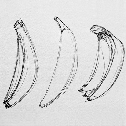
So I bought myself a hand of bananas and began to sketch it out.
Andy Warhol's banana print used on the album cover of The Velvet Underground's iconic debut record, The Velvet Underground & Nico.
STEP ONE: Exploratory design using hand sketches
STEP 2: Set up basic outline of banana in Illustrator
STEP 3: Finalise design with colour
THE RESULT
How do you like them bananas?
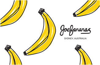
It was important that the banana was not perfect and played to the brand's tongue-in-cheek voice. Keeping the sketch lines loose and having the colour creep outside the lines was intentional in the design to reflect the unique handcrafted textiles of the brand and the overarching ethos of the brand which was 'individual'.

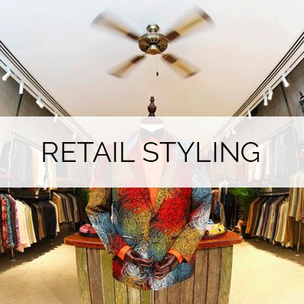
Retail Concept Store
Retail Concept Store
PROJECT:
JOE BANANAS RETAIL STORE
ROLE:
CREATIVE DIRECTOR | STYLIST
PROJECT OBJECTIVES:
Reinvent the brand's bricks-and-mortar retail presence.
The objectives of the project were:
Design a store fit-out that is representative of a luxurious and unique retail experience.
Make the customer feel like they are in a store like no other as soon as they step through the doors.
Ensure the space is impactful - but not so distracting that it overshadows the product.
Create a retail space that communicates the brand ethos with the customer via the senses.
DESIGN RATIONALE:
Whilst the brand's positioning is at the luxury end of market, its ethos and the lifestyle it promotes is far more relaxed - and so it was important that the store styling was representative of this as well.
THE PROCESS
What is this banana exactly?
In order to build an aesthetic for the brand, I had to have a comprehensive understanding of the basics:
The brand: who are they, how are they different, what is their ethos and philosophy
The product: the what & the how
The customer: the who & the why
definING THE BRAND
I sat down with the directors of Joe Bananas and workshopped the brand's ethos and marketing directives via an open table discussion. As a result of these discussions, I identified that the key marketing points were:
Lifestyle: luxurious, exclusive, relaxed and classic style that was geared towards individuality.
Luxury of the textiles: silk, linen and wool
Uniqueness of the product: handwoven raw silk, one-of-a-kind, made-to-measure tailoring
Brand inspiration: Australia and its landscapes, flora & fauna
These would form the basis of the brand style.
Competitor Analysis
After conducting a comprehensive competitor analysis of retail stores and branding through store visits, market assessment and online discovery, I ascertained that the majority of luxury brands leaned towards stark, clean styling for their retail stores. Stock lines were displayed sparsely, lighting was key, and finishes were luxe.
Lighting is atmospheric and purposeful
Product lines are displayed sparsely
Interior finishes are luxurious
However, my direction for Joe Bananas would be a little different.
THE RESULT
The Banana Experience
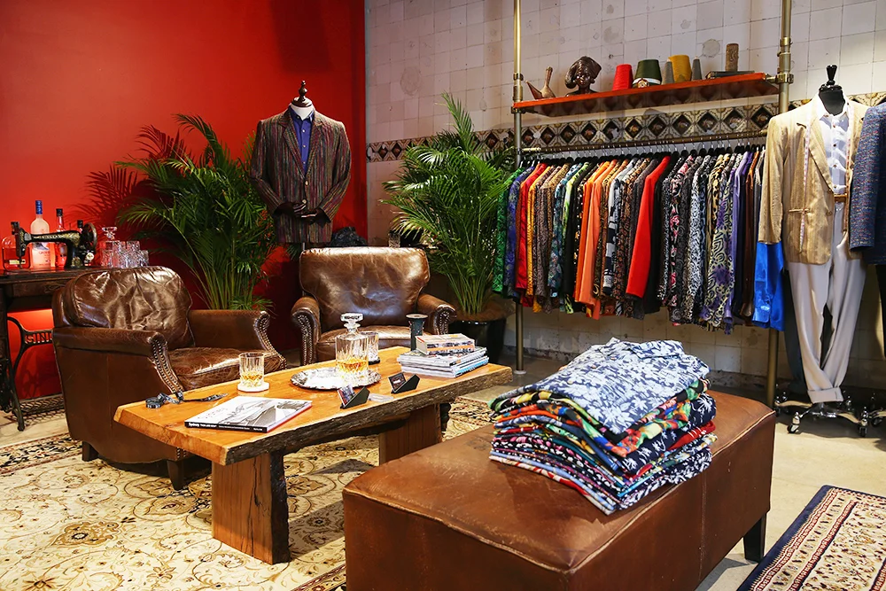
By incorporating the brand's 4 cornerstone inspirations: lifestyle; luxury; unique; Australia with the 5 senses: sight; sound; smell; touch; taste, I was able to create a unique and luxurious retail experience that immersed the customer in the brand's ethos and gave them an experience to remember.
Sight: Golden cane palms sit nestled amongst clothing that is bursting with colour. Oddities and fabric inspirations are placed surreptitiously around the store. Fresh native florals are on display.
Sound: A varying soundscape of old-school jazz and blues, orchestral pieces and relaxed modern-day tunes play discreetly to add atmosphere.
Smell: A customised scent of Australian native oils is sprayed throughout the store intermittently to further evoke a sense of the Australian naturescape.
Touch: Traditional leather lounge chairs sit atop Persian-style rugs; customised Australian hardwood tables with raw edges act as centrepieces; brass finishes; silver trays; crystal; marble.
Taste: Top-shelf spirits, Moët piccolos, locally-brewed craft beers all served on a silver tray in crystal stemware.

Rebrand
Rebrand
PROJECT:
JOE BANANAS Rebrand
ROLE:
CREATIVE DIRECTOR | Designer
PROJECT OBJECTIVES:
The Joe Bananas brand had grown organically since its inception in the 80s - and so too had its branding. In other words, it was a hodgepodge of decisions made across the decades - and not many of them made sense in today's market.
The objectives of the project were:
Create a cohesive brand style guide.
Bring the brand into the current day and elevate it to a level that would position it alongside other major international luxury brands.
RATIONALE:
As Creative Director, I felt it was crucial to provide the customer with a comprehensive customer experience across every touchpoint - analog and digital. Beyond this, I felt it was also necessary that the experience around the sale must also deliver the same level of luxury of the product itself. Basically, the brand needed to up its game and I was going to make it happen from the ground up.
THE BASICS
Colour Palette
Classic, timeless, adaptable
Matte black
Classic white
Banana yellow
Antique gold
Fonts
Modern and classic
Primary font
Secondary font
Logo + Icon
Logo treatments for print and digital usage
BRANDING IN PRACTICE
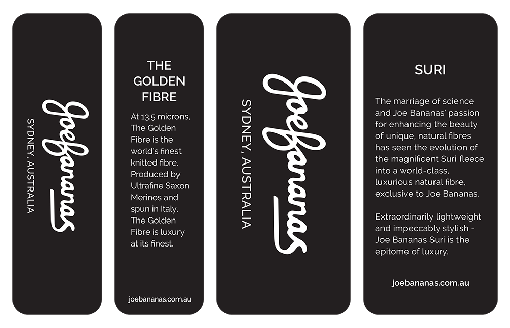
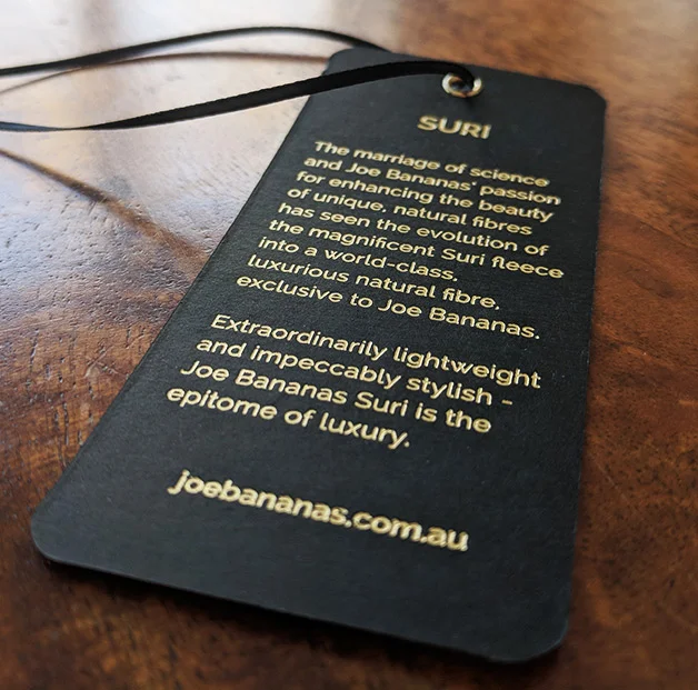
Swing tags
Business cards
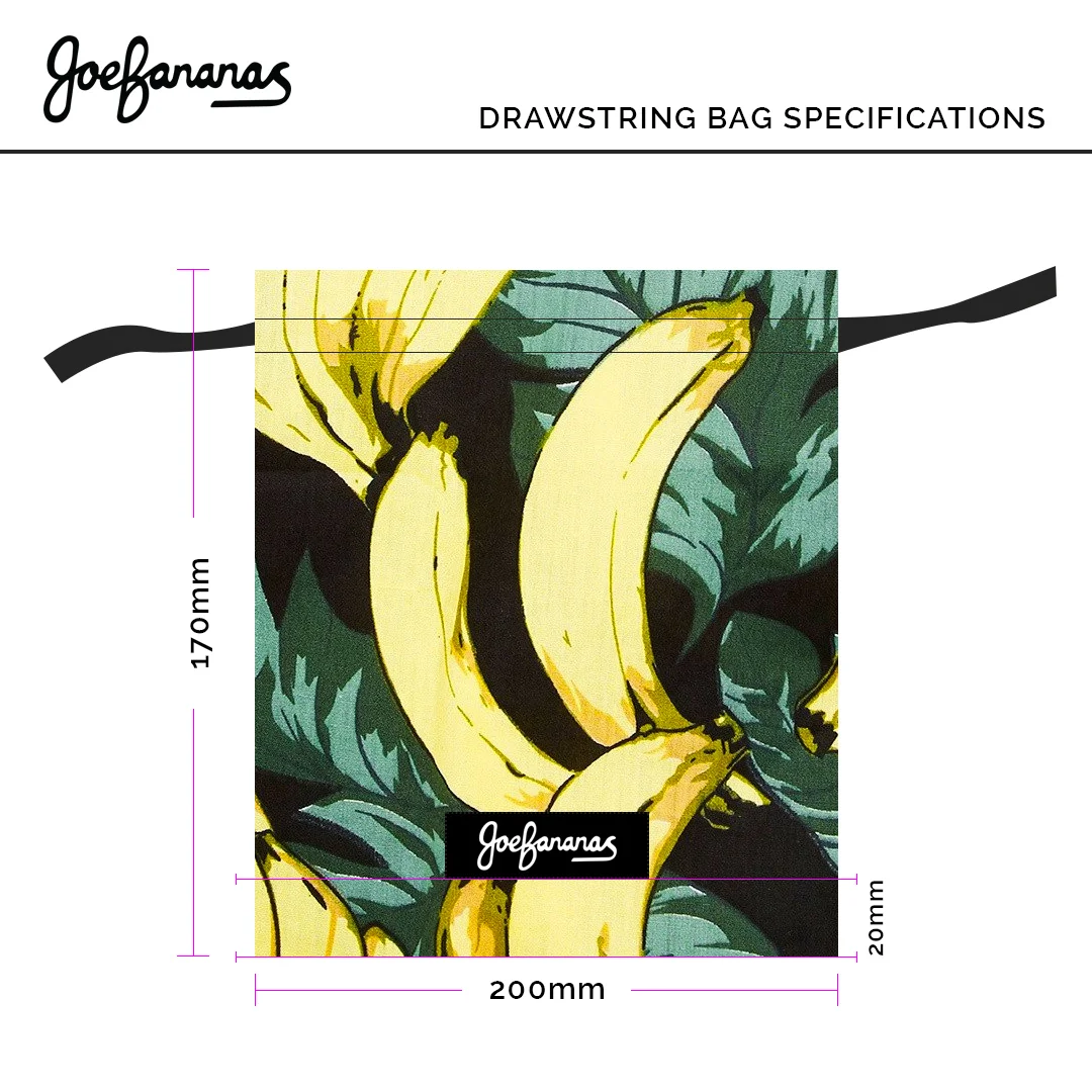
Tie + Bow tie bags

